While my usual passion for character design lies mostly in fantasy-style characters with a strong focus on fashion, I thought that for the nightmare merchant, simple yet effective character art would be much more impactful for the game.
As I pondered what asset I wanted to create for my portfolio, I thought that the main character’s human form, which to this point has been undecided, would be an interesting challenge to take on. the main character of the game, Reverie, is a toy merchant that has a knack for some sort of occult/gothic fantasy powers that allows her to transform into a mouse and traverse through dreamscapes.
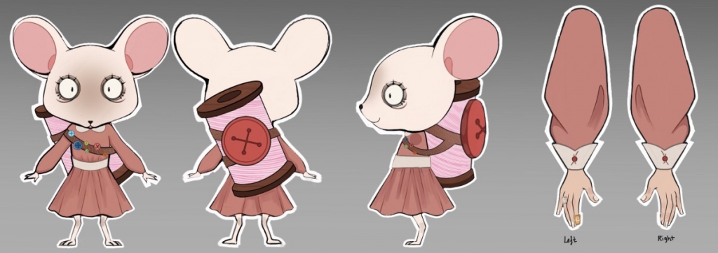
Mouse form designed by Paula Sanchez Donoso
Her mouse form is simple and effective, having a plain dress with the sewing needle and rows of pins and buttons across her chest as the main feature. As the humans in this world are simply normal clientele in the Victorian era, it would look strange for reverie to be overdesigned with large buttons and fantastical hats and outfits in the mix.
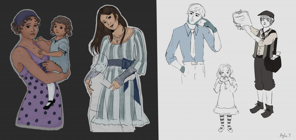
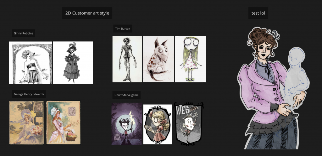
Human clientele design by Aylin Tatar
This by no means means she isn’t supposed to stand out, just that she needs a subtler charm. The problem is then thus: how do I create an effective design while limited to the constraint of the time period fashion, in a believably whimsical way?
Reverie is mentioned to be a young girl running the toy store by herself. Should the prejudice against women in this time period dictate her fashion? Should she dress more boyish, disguise herself as a man, or should she have the silhouette of a more maidenlike appearance, leaning into the seamstress aspect of her role?
To me, I believe the more boyish appearance would help with the silhouette as well as tell more of her story through simple clothing choices. But how would this match with the mouse form of her, which is much more feminine looking? I should go into the character designs with these questions in mind to create her silhouette.
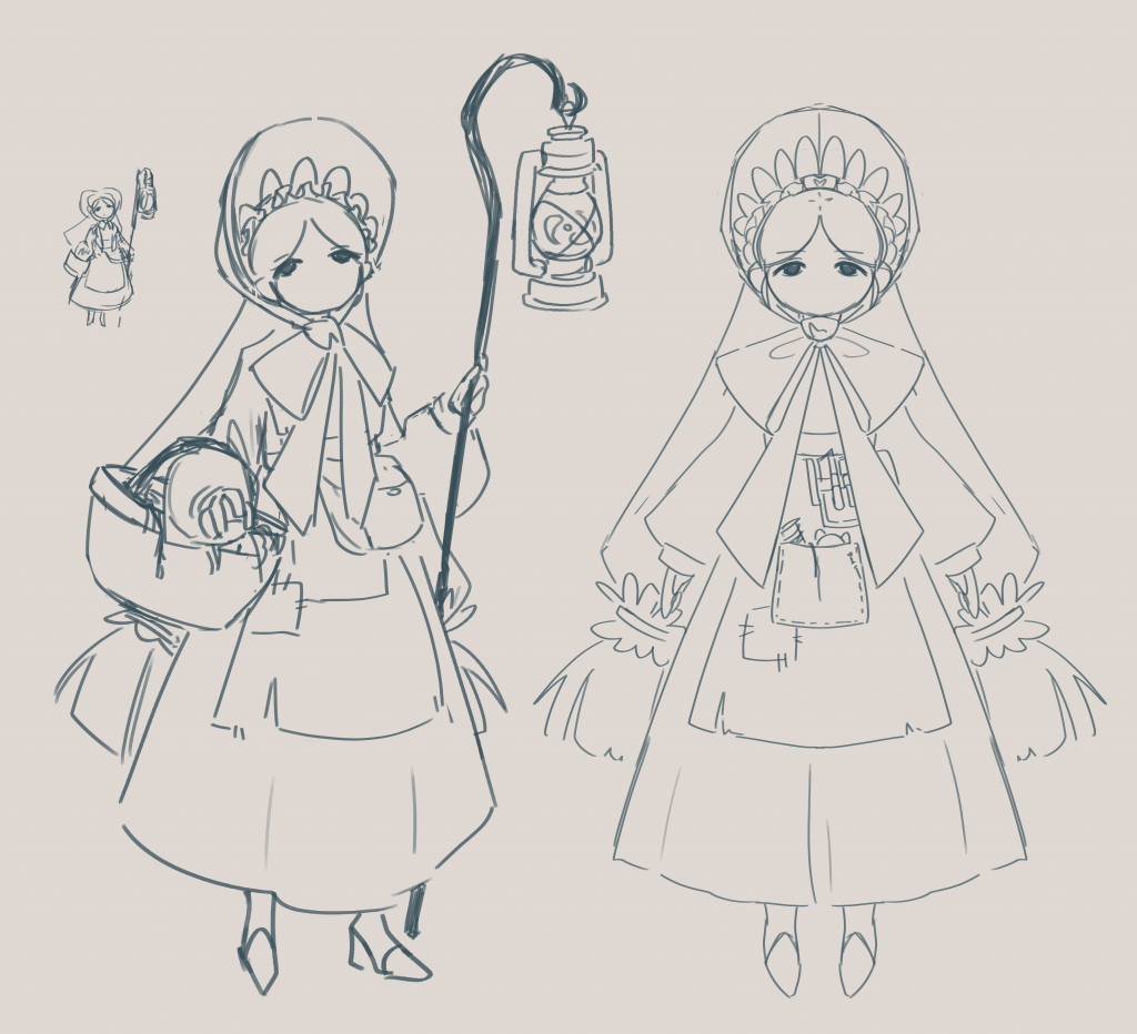
My first design of the character was made at the start of the project, when Reverie was a much less established character. In this version, she is meant to look closer to a shepherd and doll-like herself. The shepherd design is to represent guidance to lost souls, and her lack of a mouth conveys her doll-like appearance further whilst also symbolizing her preference to act over speak.
Originally at this point, a human version of the character has been created and I had started working on environment work, but later on we found out that the person working on character design had traced the design from a piece of art online. Having been set back due to this, our team went back to concepting for the main character.
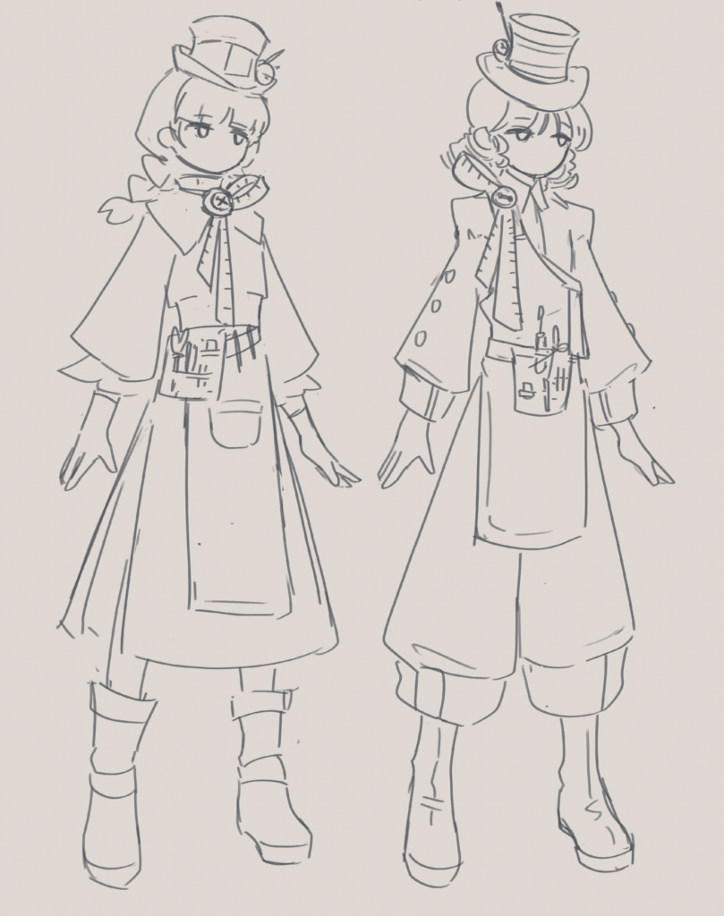
Trying to keep the silhouette of the (stolen) old design, I tried to take a jab at an updated design. I’m not quite satisfied with these, as the designs err way too much on exaggerated and fantastical design elements like spool-shaped hats and exaggerated/unnatural shaped clothing, which would not befit of her role.
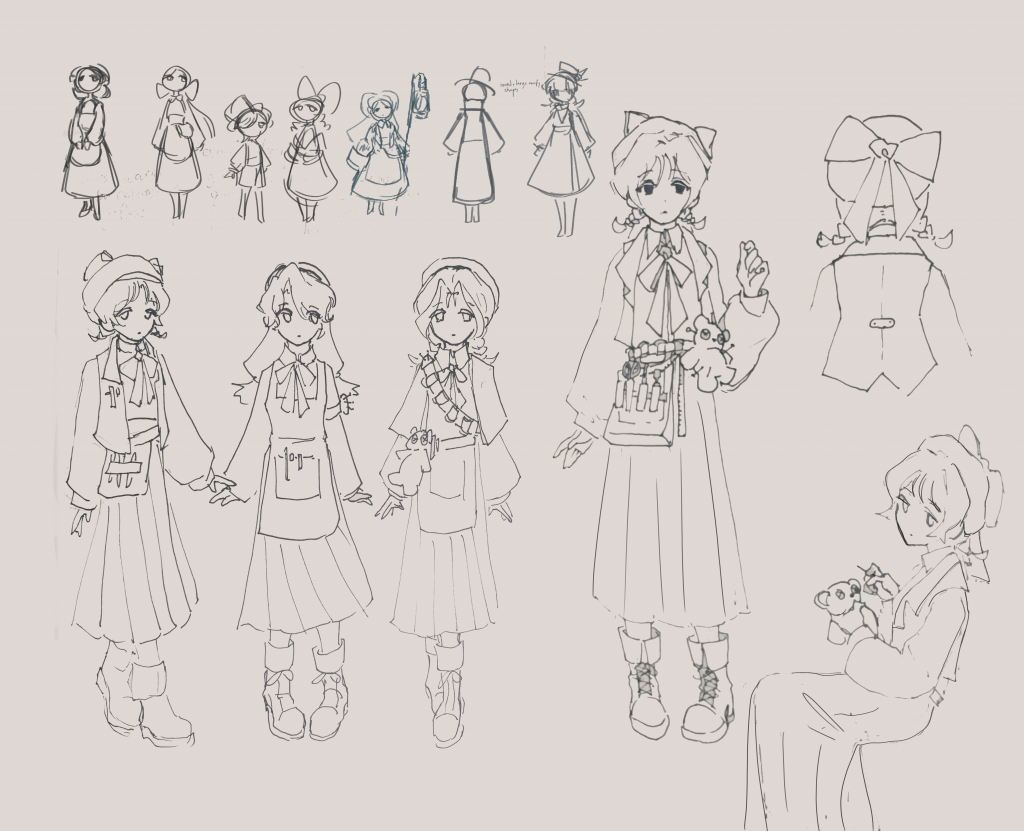
Aroud this point, we have ditched working on the human design and created the mouse version of the protagonist that would only be present in the nightmare world. After the mouse design was decided, I decided to lean into that aesthetic instead. Having a guideline for the character predetermined helps with the design process, giving healthy restrictions to work off of. The narrative team has given Reverie the characterization of a gentle person who is kind towards children, quiet and subdued with a soft sort of loneliness to her. The newer redesign focuses on keeping Reverie looking younger and meek, giving off an overall “mousey” attitude. Her large bow peeking out behind her hat mimics the shape of animal ears, and she keeps the long flowy dress present on the mouse design. Using simple design elements like bows and plushes, I was more successful in creating a design that fit into the theme of the world, making her a believable toy seller in the Victorian age.
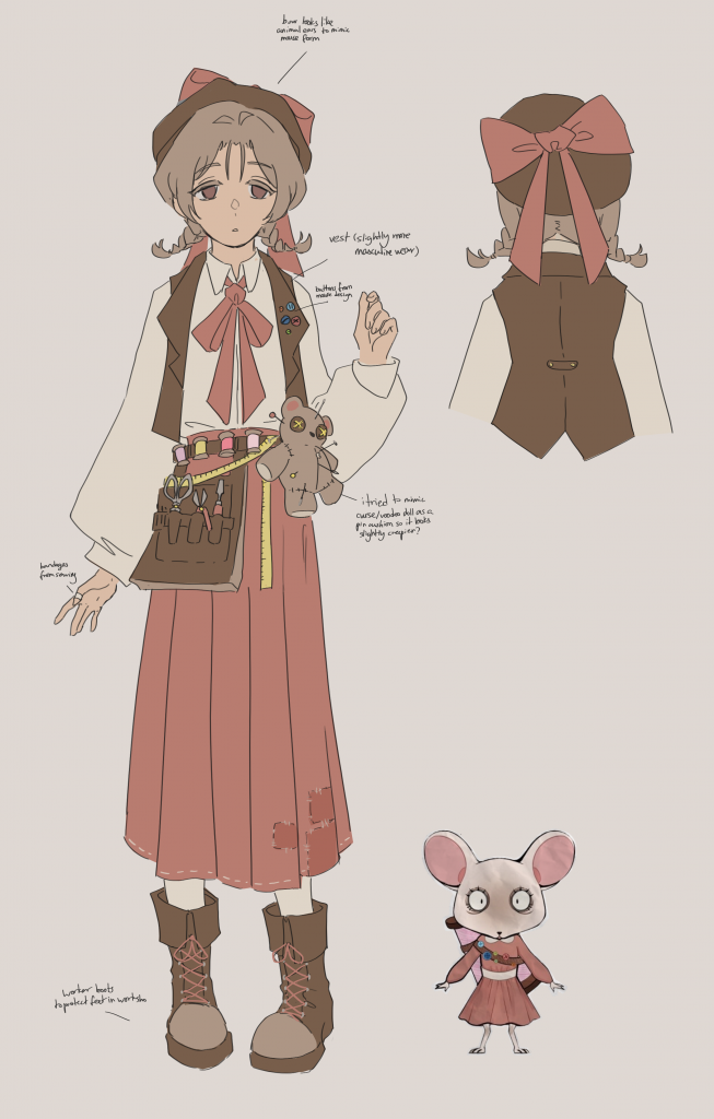
A closer look at Reverie’s final design, scaled next to her mouse form
While Reverie’s color palette was decided earlier on by the team to be low contrast and erring on warmer tones, I did try to shift her hue using gradient maps to explore what she may have looked like in other palettes.
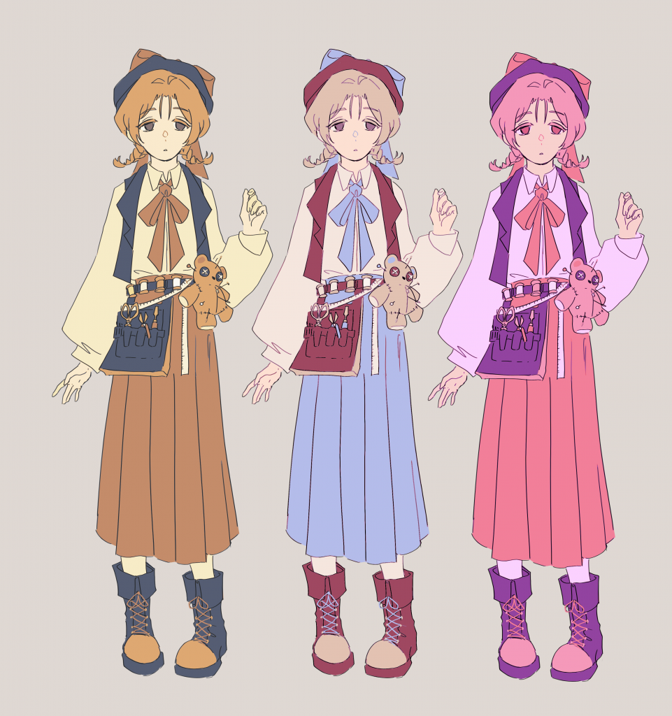
(my favorite out of the hue shifted ones is the baby blue and brown one, it reminds me of old timey dolls themed after alice in wonderland)
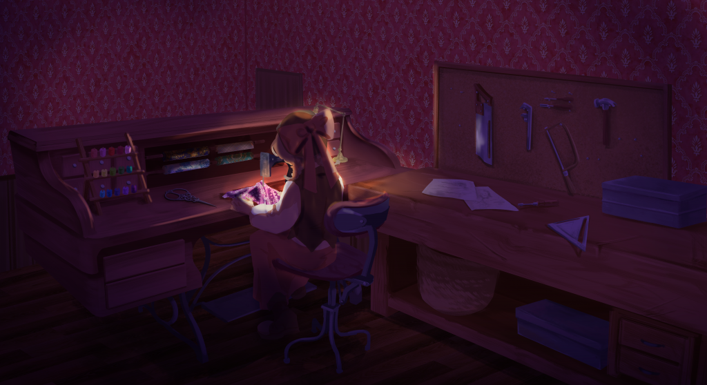
I added the design of my character in the workshop environment that I worked on in the first half of this project. I think she fits well in the scenery!
Leave a Reply